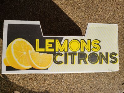
Lemon Box Letterforms
I never thought a box from a warehouse grocer would create typographic inspiration, but here we are.
The object of my obsession:

I sat playing with my kids in the driveway and this curiosity caught my eye. There it was, just inside the garage, a bulky box holding other broken-down cardboard. The contrasting shadows and lettering really played nicely against the black-to-yellow-striped gradient. The English and French labeling felt like a design decision more than a utilitarian retail requirement. I snapped a picture and then forgot about it until later that night when I brought it up to Megan. She too noticed the lemon box and planned to save it from a fate at the end of the driveway for commingled recycling pickup. We both noticed it without consultation (Marriage!).
Compelled to both honor and emulate this design, I opened codepen.
Before I go too much further, I submit this disclaimer: it's been a while since I built anything this detailed. My career is pulling me closer to what Brad Frost calls the back-of-the-front-end. So opportunities to exercise front-of-the-front-end skills now present themselves as a lark to replicate the look on a box of citrus fruit.
The Build
I knew I needed a thick border. My first attempt layered a bunch of text-shadows, like this:
See the Pen LEMONS text-shadow by Brian Muenzenmeyer (@bmuenzenmeyer) on CodePen.
What I discovered is that the shadow thickness wasn't exactly configurable in the way I had remembered it. The thicker you specify it the more it turns into a shadow, making an interesting neon effect but not what I was going for. I decided I needed an SVG.
I knew of the text element within an SVG and found a good primer on CSS-Tricks. This element supports custom fonts, CSS, and importantly, stroke and fill properties. I made good headway with this approach, overcoming several challenges but also creating new ones. For example, the stroke-linecap and stroke-linejoin attributes, in combination with particular fonts, produced odd artifacts at extreme stroke widths.
See the Pen LEMONS lettering - font - exploration by Brian Muenzenmeyer (@bmuenzenmeyer) on CodePen.
I do like some of those failures in a Pikachu or metal kinda way 🤘.
Placing the contrasting text-shadow wasn't too bad (aside from the trial-and-error-based positioning), and fell within my recollection of how to stack the effects. I imagine this could be improved. Satisfied with progress on the letterforms (and noting an issue about the accessibility of repeated text to only create the shadow), I turned my attention to the black and yellow background.
I first attempted a Sass loop to generate color stops in a repeating linear gradient. It did not go as planned.
See the Pen LEMONS gradient - worse by Brian Muenzenmeyer (@bmuenzenmeyer) on CodePen.
The stripes were inconsistently spaced, the edges seemed blurry, and it felt too brute-forced. I recall spending entirely too long tweaking the percentages and trying to get the whole thing to interpolate from my concatenated Frankenstein Sass variable into a valid attribute. There had to be a better way.
Narrator: There was.
From what I gather, I was misusing repeating-linear-gradient, trying to create the repetition myself instead of letting the CSS do that for me.
See the Pen LEMONS gradient - better by Brian Muenzenmeyer (@bmuenzenmeyer) on CodePen.
Closing the "O" on "LEMONS" and "CITRONS" was next, as was adding a viewBox, something I learned from Chris Coyier's book, Practical SVG.
See the Pen LEMONS closed O by Brian Muenzenmeyer (@bmuenzenmeyer) on CodePen.
For the finishing touches, I found an adequate lemon image and added a white border in keeping with the original box. I put a vw width on the lemon for now, so it scales a bit with the SVG.
See the Pen LEMONS picture by Brian Muenzenmeyer (@bmuenzenmeyer) on CodePen.
The Takeaways
Well, this was fun! I don't know if I will do anything further with this but it felt like a return to the type explorations of yesterday. I don't know if you learned anything from watching my process. Or rather, my reverse-engineered process. It took much longer to write this post than it did to mess around in CodePen. Other thoughts:
- I am pretty happy with my background awareness of what tools were available to me. I didn't know how to do everything out of the gate, but I knew what I wanted to do. And that made all the difference.
- I admire anyone writing technical how-to articles. I imagine folks plan the post during the build, saving valuable time along the way. This was my first one, and breaking it apart after it was nearly complete took time.
- I googled so So SO many things along the way here. Searching for things is part of the job.
- Color matching is hard! I now know why Megan keeps her expensive pantone swatches in a safe, dark place.
- Don't forget to improve the commons while you walk through it.
- Megan and I now nab these boxes whenever we can - they are sturdy, deep, and beautiful.