The Device Test Imperative
A cautionary tale... ye be warned!
This post refers to an old version of brianmuenzenmeyer.com, but the lesson is important.
When creating the masthead for this site, I was quick to ensure support in Chrome, Firefox, and IE 10-8. It was easy, I suggest too easy, to test the fluid layout and media queries by resizing the window, or using a tool like this one to gut-check various viewports.
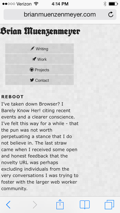
None of this, however, could satisfy the necessity of testing on a real mobile phone. Here's what I saw on mobile Safari on my iPad and iPhone:

Frustrating! What could have caused this? I kicked into Firefox's 3D mode, confirming the masthead's 200% width trick was extending the page width, but my current overflow: hidden declarations were not being honored.
Some digging revealed that mobile Safari overflow rendering rules are different, and that I should try the following CSS.
html {
    overflow-x: hidden;
}
Sure enough, fixed for all tested version of Safari. Need to test Android and other devices, sure, but this was another small reminder to get into a browser - especially mobile browsers, as soon as possible.